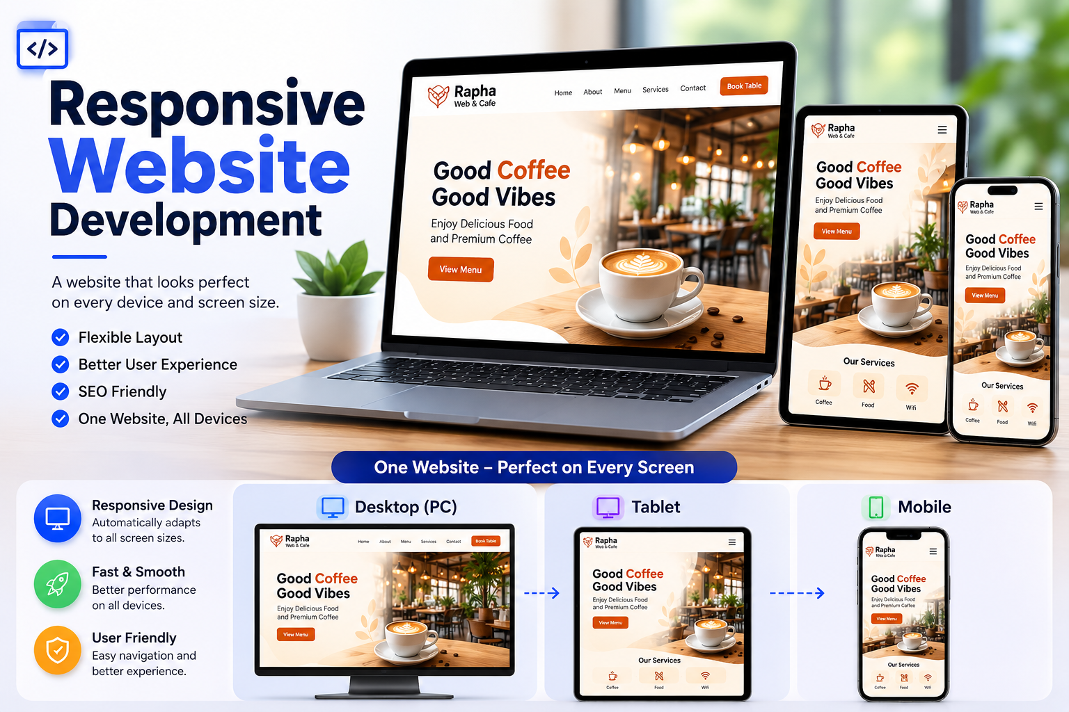
Responsive Website Development
A website where the layout flexibly adjusts according to the browser window size. It is designed to display naturally across various smart devices without content being cut off or distorted. Since a single website adapts its layout to different resolutions, it provides optimal viewing experience on all devices. Typically, it is structured around three main breakpoints: PC (Desktop), Tablet, and Mobile.
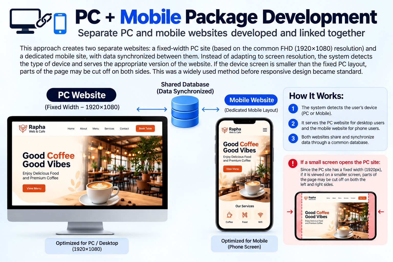
PC + Mobile Package Development
Separate PC and mobile websites developed and linked together This approach creates two separate websites: a fixed-width PC site (based on the common FHD(1920x1080) resolution) and a dedicated mobile site, with data synchronized between them. Instead of adapting to screen resolution, the system detects the type of device and serves the appropriate version of the website. If the device screen is smaller than the fixed PC layout, parts of the page may be cut off on both sides. This was a widely used method before responsive design became standard..
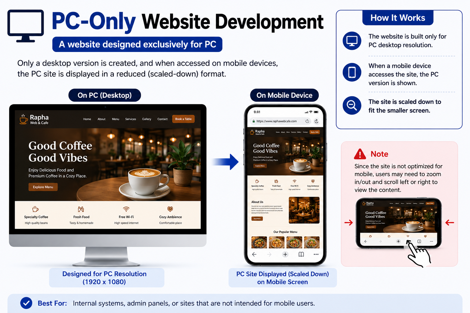
PC- Only Website Development
A website designed exclusively for PC users, Only a desktop verion is created, and when accessed on mobile devices, the PC site is displayed in a reduced (scaled-down) format.
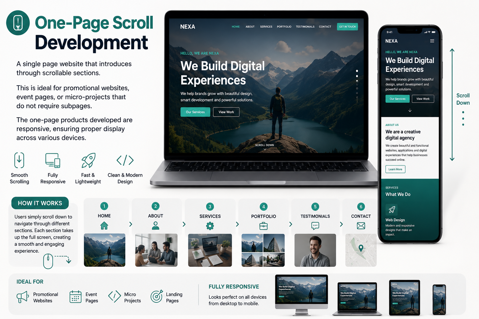
One- Page Scroll Development
A single page Website that introduces through scrollable section. This is ideal for promotional Websites, event pages, or micro-projects that do not requires subpages. The One-Page products developed are responsive, ensuring proper display across various devices.
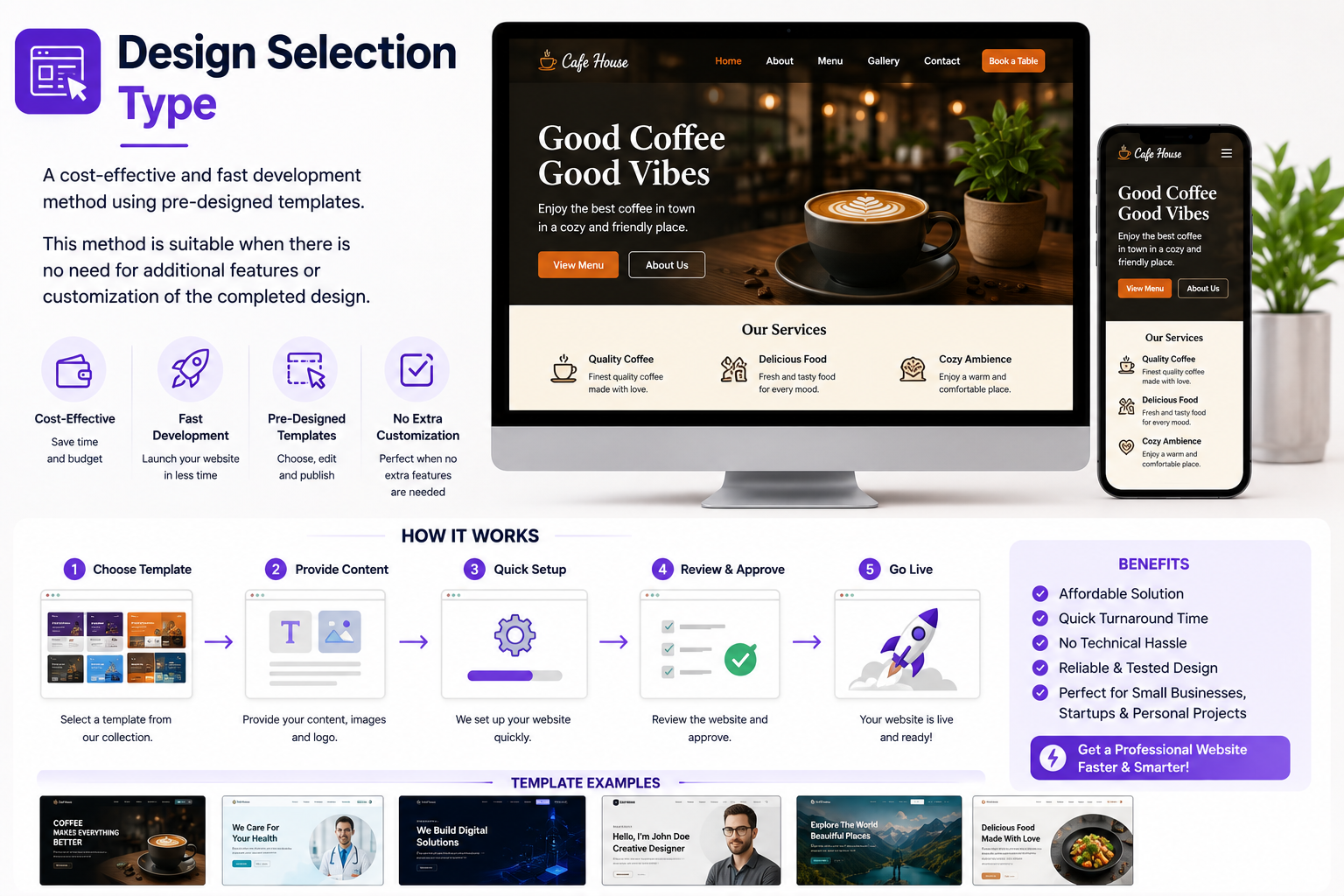
Design Selection Type
A cost-effective and fast development method using pre-designed templates. This method is suitable when there is no need for additional features or customization of the completed design.
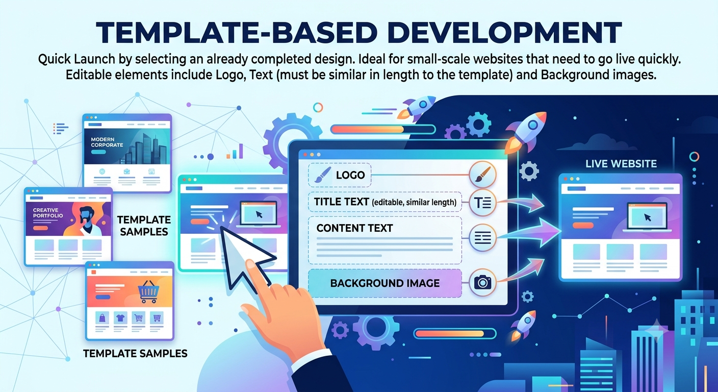
Template-Based Development
Quick Launch by selecting an already completed design. This is deal for small-scale websites that need to go live quickly, You can choose one of template samples for the main page and begin development immediately. Editable elements include Logo, Text (must be similar in lenght to the template) and Background images.